SVG color and contrast
The primary focus of accessible SVGs is screen readers compliance – which is only part of the issue and part of the solution. Globally, people with low-vision and color blindness outnumber the people who are blind 14:1. We are talking a staggering 546 million in total (246 million low-vision users plus 300 million colorblind users) vs. 39 million users who are legally blind.
Many people with low-vision and colorblindness do not rely on screen readers, but may instead use tools like browser resizing, customized stylesheets, or magnification software to help them see what is on the screen. To these 546 million people, screen reader output is probably not as important to them as making sure the color and contrast is great enough that they can see the SVG on the screen.
Tools and checks
The very first step you should take when designing your SVG color palette is to review the WCAG color contrast ratio guidelines. While SVGs and other icons were exempt from color contrast ratio requirements not too long ago (when targeting WCAG AA compliance), the recent update to the WCAG 2.1 guidelines have made it so all essential non-text imagery must adhere to a contrast ratio of at least 3:1 against adjacent colors.
One example of an essential non-text image is an SVG icon used as a CTA button or link – such as we see in a home button. In this SVG, we see a line drawing of a house with no visual text. This is a good first step, but choosing the correct SVG pattern is one piece of the puzzle – another piece is the color contrast between the icon and its background.
To check for accessible color contrast ratios, there are many tools available for use. For a quick color contrast spot check, you could use the Contrast Checker in Chrome DevTools. For checking color contrast on non-coded designs, check out the Colour Contrast Analyser tool. And for a full-color palette review, A11y Color Palette is a great way to help you see which color combinations are the most accessible.
Light/dark mode
Beyond checking for color contrast ratios, you should also consider the increasingly popular and supported media query called @prefers-color-scheme that allows a user to choose a light or dark themed version of the website or app they are visiting. While this media query does not replace checking for color contrast ratios, it can give your users more choice when it comes to the overall experience of your website or app.
Allowing your users to choose their experience is always better than assuming you know what they want.
As with other media queries, to see the light/dark theme changes, the website or app developer must add additional code targeting the query. Setting up your designs to use CSS to control style elements means that creating a dark theme version of your SVG can be relatively simple.
Color and contrast accessibility
While the above examples are fun ways to show what you can do with color and contrast and the @prefers-color-scheme media query, there are some really great real-world reasons to consider adding a dark theme including:
- Dark themes are helpful to people with photophobia, or light sensitivity. People with photophobia can trigger headaches and migraines when they view a website or app that is too bright.
- Some people find the text on a website or app easier to read in dark mode while others might find lighter themes are easier to read – it essentially comes down to giving your user a choice and allowing them to set their preference.
- Unlike some other color or contrast based media queries, the browser support is pretty universal for
@prefers-color-scheme– so this media query is useful out of the box today and it should be sticking around for awhile.
SVG animation
In conjunction with color and contrast, how your SVG moves on the screen is another aspect to consider when designing and developing with inclusiveness in mind. The WCAG motion guidelines are clear: non-essential moving, blinking, or scrolling information that starts automatically, lasts more than five seconds, and is part of other page elements must allow the user to pause, stop, or hide it. But why do we need this rule?
For some users, moving, blinking, or scrolling content can be very distracting. People with ADHD and other attention deficit disorders might be so distracted by your animated SVGs they forget why they even went to your website/app in the first place. While for other people, motion can trigger physical reactions. For example, people with vestibular issues can become nauseous and dizzy when viewing movement. While others can be triggered to have a seizure when viewing content that flashes or is bright – a situation you obviously want to avoid.
While we all like being "delighted" with interesting website and app features – we need to strike a balance between being creative versus distracting (or harming) our users during their interaction with moving content.
Manual/auto stop
Since SVG animations, like other moving content, must not auto-play for more than five seconds, you must create a way for users to pause or stop the animation. One way to do this is to create a JS toggle button to play/pause the animation.
If your SVG is large or is the main feature of your website, a pause/play button at the top of the screen might be a realistic option to control the entire experience of the page. If your SVGs are smaller in scale or related to user input, a pause/play button might not be realistic for each individual image, so an alternative option is to code the animation to stop at five seconds vs. playing it on an infinite loop.
Reduced motion
In addition to using a pause/play option or creating a finite animation loop, you may also consider adding @prefers-reduced-motion media query to address the animation in your SVGs. Similar to the light/dark theme example, the @prefers-reduced-motion media query checks the user's settings for motion restrictions and then implements a visual experience based on their preference. In the case of @prefers-reduced-motion, a user can choose to minimize the amount of animation or motion they see.
Keep in mind, having @prefers-reduced-motion code in place is one step in making your SVGs more accessible, but you also need to consider the way the motion is reduced. For example, let's say you create a slowed-down version of your SVG animation using @prefers-reduced-motion. However, the slower version is on an infinite loop so the animation lasts more than five seconds, which violates one part of the WCAG rules on motion.
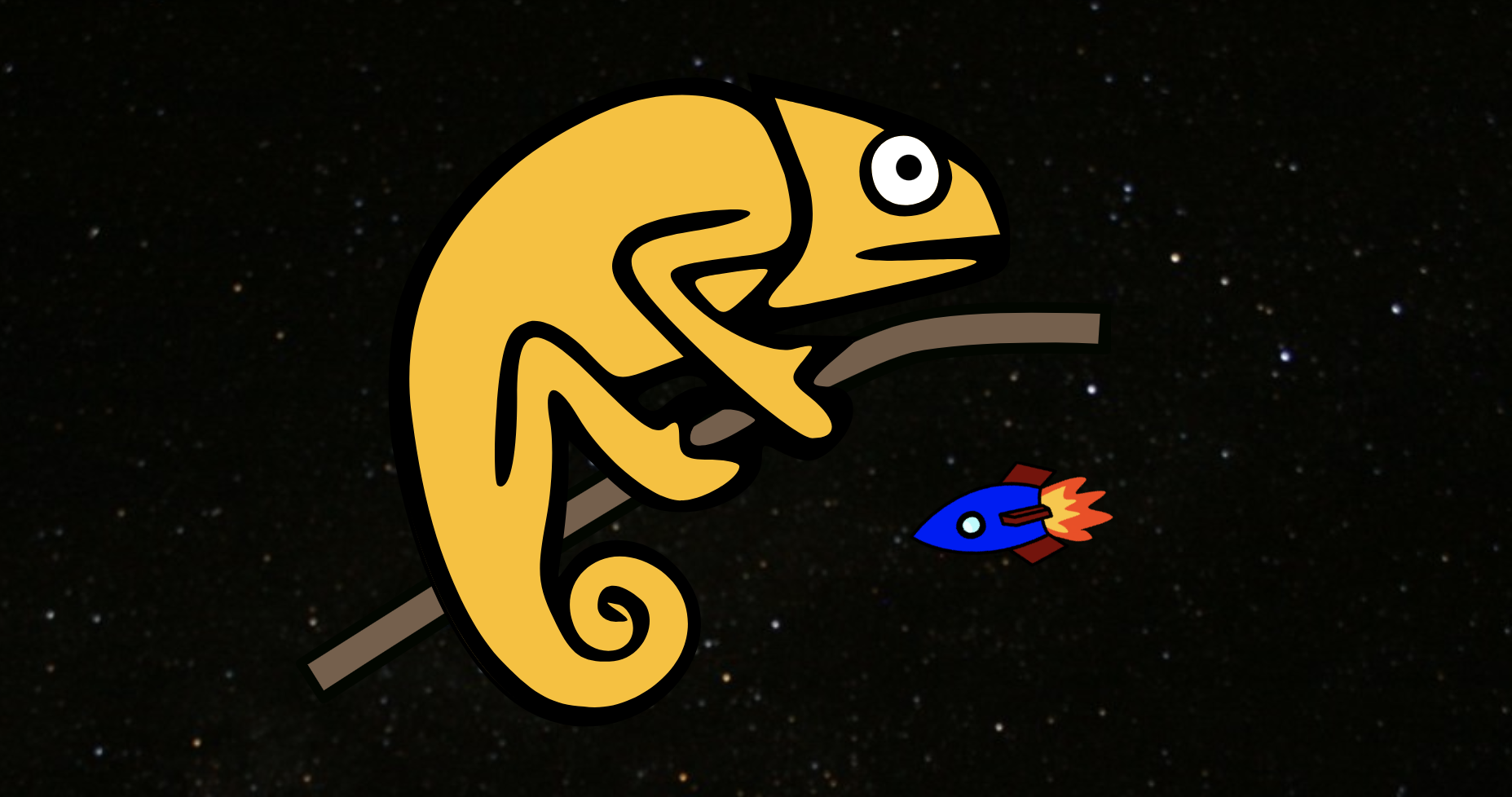
In the next example, Karma Chameleon has a @prefers-reduced-motion media query. In the light mode with reduced motion, she is in a forest with a stationary red butterfly. In dark mode with reduced motion, she is in space with a stationary blue rocket in the background.
Animation accessibility
From an accessibility standpoint, there are some great reasons to consider limiting the movement on your screen or providing alternative animations in your SVGs including:
- Less is more! Keeping your SVG animations simple for people with cognitive and attention disorders can help with your overall user experience. This is especially true for SVGs critical to the content or functionality of your website or app – such as navigation, buttons, links, or any animation triggered by user input.
- Don't make people sick! Some people with seizure, vestibular, and vision disorders can trigger physical reaction by motion in your SVGs, so please be responsible with your designs and code.
- Most major browsers now support
@prefers-reduced-motionmedia query both on desktop and mobile devices – meaning that more people can limit their exposure to unwanted movement on their screens.
Wrapping up
Color, contrast, and animation is at the heart of every SVG. Studies report that these visual elements hold intrinsic meaning, contribute to brand recognition, and are tied to a company's perceived value – making SVGs a very large area where designers and developers can have a direct and immediate impact on our users.
But it is also important that we don't just think of SVG accessibility as something to help "other people" – because who hasn't found themselves in a situation where they have to battle glare on a device screen? Or you have a migraine and SVGs keep floating on and off the screen making you sick instead of "delighted". Or maybe you visit a website in a low-light setting and the text is hard to read due to the gray-on-gray color scheme?
With the use of accessibility tools, WCAG guidelines, and the continued addition and support of new CSS media queries to allow for more choice, we can impact all people in a more responsible and inclusive way.
For true digital inclusivity is understanding that every single one of us can benefit from more accessible designs and code.